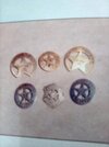
Some of the badges towards the end of the shoot where cardboard cut -outs, for distance shots as a lot of badges actual shall we say "disappeared" ! this story is disputed,but Pete told me himself...I think cast may have "acquired" them !!Thanks for that thorough research greenmachines...I love it
You are using an out of date browser. It may not display this or other websites correctly.
You should upgrade or use an alternative browser.
You should upgrade or use an alternative browser.
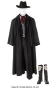
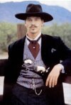
Tombstone Val Kilmer / Doc Holliday Costume
- Thread starter JohnHolliday
- Start date
Cameron1138
Sr Member
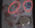
You are OK for color but the flowers on Docs are side view not straight into the bloom. Like Dutch folk art.This was just done on my phone by adjusting tone and saturation and stuff but I think this is pretty close. I might try ordering some test prints from Spoonflower or Contrado soon unless anyone wants to work on making a more accurate rose design:View attachment 1878371View attachment 1878372View attachment 1878373
Just now saw yours does have several side view as well.
Last edited:
Dropping this link here for the Fred White build by Dr Jones Sr. As usual, he is killing it already. Posted first round draft today and it is stellar.
Thread 'Tombstone Marshal Fred White' Tombstone Marshal Fred White
Thread 'Tombstone Marshal Fred White' Tombstone Marshal Fred White
JohnHolliday
Sr Member
I am in the process of making the correct Tombstone (movie) Town Marshal Badge. It should be finished by late this year or early next year. It took me forever to find what was actually written on the badge, otherwise it would have been made when I did the other 2 Tombstone (movie) badges. This is the same badge that was worn by Fred White and all 3 of the Earps at the shootout at the O.K. Corral.I'm working on a different Tombstone character, Marshal Fred White. (I only cosplay old guys with grey beards.)
I just can't find any stills showing his belt or buckle from the front. From the back we can see it's plain black leather, as is his holster.
His badge is a small ornate style which I've not found reproductions of. There'a a Denix one that's close, but too big. The photo is of a vintage Sterling Silver badge which seems to be what he's wearing.
I'm going to paint up a 3D printed Colt SAA and try to get the effect of ivory grips, case-hardened frame, and blued cylinder and barrel, which I've never tried doing before.
His derby/bowler changes colour in every shot but seems to be the colour Stetson calls Caribou. (It's the colour of Chief Jim Hopper's hat which also looks different in every shot.)
In general a quite easy costume to do, especially as he wears the same costume throughout.
JohnHolliday
Sr Member
That is not the badge worn in the movieBottom Middle Badge Fred
JohnHolliday
Sr Member
Where were you when I was making this badge????As for the deputy badge in question for Doc....
I preface with two statements:
1) Only today did I get an image clear enough to see the differences I list below. My apologies for not having found this earlier but I did try.
2) Right up to finding this photo and until one is cast, JohnHolliday has made the closest duplication I have seen.
Here I draw my line in the sand. Screen accurate badges are not currently available, to my knowledge, including all that have been sold through the propstore as Originals from the movie. I won't budge on this unless photos can be provided matching the picture of Kurt I am posting here. All articles claim that all 10 deputy badges were the same mold. Either this is not an accurate fact or the badges being offered are not from the movie.
Given that numerous badges are proferred online as a match or even an original, the screencaps from the movie are my goto and my final answer, with a little waffling when someone offers poster pictures due to their inherent inaccuracy to the actual released film footage.
I finally got a higher resolution of Kurt's badge. It is the same as offered earlier but now with enough detail to solidly CONFIRM that:
1) there is no central star outline line printed in black within the cutout star shape but only the letters "U. S." with definite periods, NOT WITHOUT. The period for the S is falling off the edge but is present. If it is not falling off the edge it is NOT a match. The mold of the letters was obviously slightly shifted from the mold of the star or the smith's "U.S." Stamp was pre-assembled as that phrase. Meaning, they could miss slightly and hang the period but it is there.
2) There IS a circle printed near the exterior of the outer edge of the badge but is quite thin and disappears when the picture is blurry.
3) There are NO IMPRINTED STARS anywhere on this badge. None. Zero. Emphasis on "they are not there". Only one star pattern exists and it is the shape of the inside of the badge itself having the original circle cut through in five pie slices. I assume the aberation in the mid right side looked like a star in the blurrier pictures and matched the expected stars as seen on historic badges. They don't exist on this badge. (again kudos to johnholliday)
4) and now for the sad one, this is a SERIF FONT, meaning all the letters have the little wings and end cap bars at the extremes vs sans serif which are without the decorations. Times New Roman is an example of a serif font whereas Arial is sans serif but I will need to research further to get you an exact font if one exists. It could very well be custom and not a true font. 7 years as a professional typesetter and few fonts have eluded me since. Again, sorry I did not have a good enough photo to catch this earlier but it isn't even a light serif, it is heavy.
Further notes and my white flag of truce:
1) Assumption made: Kurt's badge is the same deputy badge as Val's
2) All previously found sources claim all deputy and circular badges on the movie were from the same mold.
3) Several posters were made with a mish mash of guns, holsters, coats, hats and badges that were not used by those actors in any scene but were instead worn by others or not worn, so the posters are not wonderful as a final answer.
4) This badge, though blurrier in previous pics, seems to be consistent for Val and Kurt.
As case in point, the image, as seen posted here, loses some important detail when viewed without zooming. Please open the picture and zoom in.
View attachment 1878184
View attachment 1878187
JohnHolliday
Sr Member
Fred White/Earps BadgeView attachment 1878639
JohnHolliday
Sr Member
JohnHolliday
Sr Member
it keeps looping to an error but it might be my internet speed.Fred White/Earps BadgeView attachment 1878639
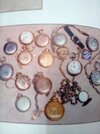
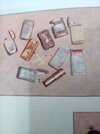
Some original badges,watches & pocket carry from the movieAs for the deputy badge in question for Doc....
I preface with two statements:
1) Only today did I get an image clear enough to see the differences I list below. My apologies for not having found this earlier but I did try.
2) Right up to finding this photo and until one is cast, JohnHolliday has made the closest duplication I have seen.
Here I draw my line in the sand. Screen accurate badges are not currently available, to my knowledge, including all that have been sold through the propstore as Originals from the movie. I won't budge on this unless photos can be provided matching the picture of Kurt I am posting here. All articles claim that all 10 deputy badges were the same mold. Either this is not an accurate fact or the badges being offered are not from the movie.
Given that numerous badges are proferred online as a match or even an original, the screencaps from the movie are my goto and my final answer, with a little waffling when someone offers poster pictures due to their inherent inaccuracy to the actual released film footage.
I finally got a higher resolution of Kurt's badge. It is the same as offered earlier but now with enough detail to solidly CONFIRM that:
1) there is no central star outline line printed in black within the cutout star shape but only the letters "U. S." with definite periods, NOT WITHOUT. The period for the S is falling off the edge but is present. If it is not falling off the edge it is NOT a match. The mold of the letters was obviously slightly shifted from the mold of the star or the smith's "U.S." Stamp was pre-assembled as that phrase. Meaning, they could miss slightly and hang the period but it is there.
2) There IS a circle printed near the exterior of the outer edge of the badge but is quite thin and disappears when the picture is blurry.
3) There are NO IMPRINTED STARS anywhere on this badge. None. Zero. Emphasis on "they are not there". Only one star pattern exists and it is the shape of the inside of the badge itself having the original circle cut through in five pie slices. I assume the aberation in the mid right side looked like a star in the blurrier pictures and matched the expected stars as seen on historic badges. They don't exist on this badge. (again kudos to johnholliday)
4) and now for the sad one, this is a SERIF FONT, meaning all the letters have the little wings and end cap bars at the extremes vs sans serif which are without the decorations. Times New Roman is an example of a serif font whereas Arial is sans serif but I will need to research further to get you an exact font if one exists. It could very well be custom and not a true font. 7 years as a professional typesetter and few fonts have eluded me since. Again, sorry I did not have a good enough photo to catch this earlier but it isn't even a light serif, it is heavy.
Further notes and my white flag of truce:
1) Assumption made: Kurt's badge is the same deputy badge as Val's
2) All previously found sources claim all deputy and circular badges on the movie were from the same mold.
3) Several posters were made with a mish mash of guns, holsters, coats, hats and badges that were not used by those actors in any scene but were instead worn by others or not worn, so the posters are not wonderful as a final answer.
4) This badge, though blurrier in previous pics, seems to be consistent for Val and Kurt.
As case in point, the image, as seen posted here, loses some important detail when viewed without zooming. Please open the picture and zoom in.
View attachment 1878184
View attachment 1878187
Attachments
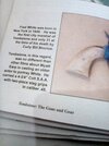
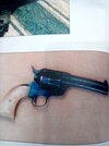
A better shot of the fred gun...grips are plain-ish stagI'm working on a different Tombstone character, Marshal Fred White. (I only cosplay old guys with grey beards.)
I just can't find any stills showing his belt or buckle from the front. From the back we can see it's plain black leather, as is his holster.
His badge is a small ornate style which I've not found reproductions of. There'a a Denix one that's close, but too big. The photo is of a vintage Sterling Silver badge which seems to be what he's wearing.
I'm going to paint up a 3D printed Colt SAA and try to get the effect of ivory grips, case-hardened frame, and blued cylinder and barrel, which I've never tried doing before.
His derby/bowler changes colour in every shot but seems to be the colour Stetson calls Caribou. (It's the colour of Chief Jim Hopper's hat which also looks different in every shot.)
In general a quite easy costume to do, especially as he wears the same costume throughout.
Attachments
Cameron1138
Sr Member
Yeah, unfortunately this was the closest design I could find that had the right colors. I did just find this seamless pattern creator so I'll see if I can make anything better.You are OK for color but the flowers on Docs are side view not straight into the bloom. Like Dutch folk art.
Just now saw yours does have several side view as well.
Looks like a small not fully open rose below the two I circled. Like partially open bud.Yeah, unfortunately this was the closest design I could find that had the right colors. I did just find this seamless pattern creator so I'll see if I can make anything better.
Cameron1138
Sr Member
The tricky part so far is finding images that are close enough, it ultimately might not end up being much more accurate than the one I found earlier. (Or it might be more accurate but less good.) I'm also unsure of the legality of taking whatever transparent PNG flower drawings I can find and using them to create solid-color silhouettes for the pattern if I want to make this design available for anyone to use...Looks like a small not fully open rose below the two I circled. Like partially open bud.
Sometimes just having the clearer images (flowers), placed in the right positions can be used to trigger successful Google vision or google images searches. It just needs a leg up from the blurry that we have offered it so far. Possibly finding the actual material.The tricky part so far is finding images that are close enough, it ultimately might not end up being much more accurate than the one I found earlier. (Or it might be more accurate but less good.) I'm also unsure of the legality of taking whatever transparent PNG flower drawings I can find and using them to create solid-color silhouettes for the pattern if I want to make this design available for anyone to use...
Cameron1138
Sr Member
I might try again tomorrow but I think I've reached the limits of my graphic design skills lol, I just don't have an eye for this. What I've done so far is very clearly pasted together on a computer using images of flowers drawn by different people in different art styles rather than looking like a cohesive Victorian-era print. I think the image I found earlier will look more authentic for the period even though it's not as accurate (but of course anyone with more of an eye for this kind of thing is free to try too).
Similar threads
- Replies
- 2
- Views
- 4,476
- Replies
- 60
- Views
- 5,705
- Replies
- 306
- Views
- 15,812
- Replies
- 16
- Views
- 3,484

