You are using an out of date browser. It may not display this or other websites correctly.
You should upgrade or use an alternative browser.
You should upgrade or use an alternative browser.
Stranger things
- Thread starter Pitbull
- Start date
UnusualWizardry
Sr Member
Did the same search without the text and almost instantly got that image:
View attachment 1832250
Well damn. My Google just hates me I guess. lol. That’s exactly what I did.
RafalFett
Sr Member
Well damn. My Google just hates me I guess. lol. That’s exactly what I did.
I don't think Google hates you, I just tried different areas and maybe annoyed the hell out of it before the correct result showed up.
I don't know if this can help but I did this some while ago to stop my daughter asking  : not as crisp as what you're looking for (blurry in edges) but pretty good when printed. Everything here is pure screen grab (except software enhancement of course).
Attachments
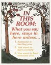
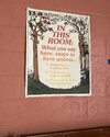
It's watermarked for sure but is it copyrighted? (such stock photos websites often fool us to buy what they don't own...). Cleaning or working on a design doesn't mean you own the rights on it does it?Found the image in BW; the description says that it is from an antique children's book (link here ==> Tree frame):
View attachment 1832009
It might have been colorized by the production team. The font used is ITC Souvenir Demi Italic.
I'm already working on the poster, but due to the copyright/watermark I won't share it for obvious reasons (maybe if someone will buy that image, than we can share it publicly).
Here's the teaser:
View attachment 1832047
(sincere naive question as I doubt they can own such old design, your knowledge is welcome...).
Last edited:
RafalFett
Sr Member
I don't know if this can help but I did this some while ago to stop my daughter asking: not as crisp as what you're looking for (blurry in edges) but pretty good when printed. Everything here is pure screen grab (except software enhancement of course).
Thanks for the reply. We're already sorted out with the image (thanks to UnusualWizardry ) and I'm working on it right now. I vectorized the B/W image and now I just have to add the colors. The text is already done. Will post most likely this week.
ribeiroorafael
Active Member
Anyone have anything else that matches with my expertise to replicate? I’ve no idea right now
RafalFett
Sr Member
Last edited:
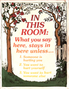
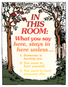
great, I did the same from the same screen grab.Here's the image with the perspective corrected from the link shared by ribeiroorafael:
View attachment 1832305
Great thanks for re-sharing : Season two so 2018 or so! Far already but still good. I guess I made mine back in 2020-2021 but never thought anyone else but my daughter could have such an interest. I can't wait to see the "crisp" one! Thanks in advance.Here's the image with the perspective corrected from the link shared by ribeiroorafael:
View attachment 1832312
I second that, "free paper props forum" includes something like "paper" (but OK, English isn't my native language).
If I may, your perspective is great but don't forget the curbs of a soft paper pined freely on a wall : I did the same mistake back in the days, it may seems useless but when printed our eyes see it. As you seem to vectorize your artworks maybe you do that on the next step?Here's the image with the perspective corrected from the link shared by ribeiroorafael:
View attachment 1832312
Once again my English is bad so I join a photo (blue lines show a "straight" frame whithout curbs shown on your copy). I hope it helps.
Attachments
UnusualWizardry
Sr Member
I was encouraged to go ahead and share this by ribeiroorafael.
Though I am probably going to completely redo it, as I think I missed it up in some areas.
"Save Downtown" Flyer from Season 3 (8.5" x 11")
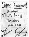
Did a lot with actual handwriting with different colored markers and real scanning effects to reproduce the specific look with some additional overlays here and there.
I really feel like I could do it better (particularly the bottom Starcourt area), so I will redo it eventually.
Hope you all like and enjoy it for now!
Though I am probably going to completely redo it, as I think I missed it up in some areas.
"Save Downtown" Flyer from Season 3 (8.5" x 11")

Did a lot with actual handwriting with different colored markers and real scanning effects to reproduce the specific look with some additional overlays here and there.
I really feel like I could do it better (particularly the bottom Starcourt area), so I will redo it eventually.

Hope you all like and enjoy it for now!
RafalFett
Sr Member
If I may, your perspective is great but don't forget the curbs of a soft paper pined freely on a wall : I did the same mistake back in the days, it may seems useless but when printed our eyes see it. As you seem to vectorize your artworks maybe you do that on the next step?
Once again my English is bad so I join a photo (blue lines show a "straight" frame whithout curbs shown on your copy). I hope it helps.
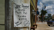
Yeah, I know. Any feedback is a constructive feedback! Actually I did the corrections just so I can search it with Google Lens. The curvature was more pronounced, but as I said it was a rush job. Here's the photo I was working from:
The B/W version does not have the curvature problem.
Last edited:
RafalFett
Sr Member
I was encouraged to go ahead and share this by ribeiroorafael.
Though I am probably going to completely redo it, as I think I missed it up in some areas.
"Save Downtown" Flyer from Season 3 (8.5" x 11")
View attachment 1832349
Did a lot with actual handwriting with different colored markers and real scanning effects to reproduce the specific look with some additional overlays here and there.
I really feel like I could do it better (particularly the bottom Starcourt area), so I will redo it eventually.
View attachment 1832350
Hope you all like and enjoy it for now!
That is a though one but you did a great job. How about the original/before scan version just like the Missing Will poster?
Just kidding.
This was also on my long to-do-list, but now I can rest... In no time we will run out of paper props from all 4 seasons.
UnusualWizardry
Sr Member
In no time we will run out of paper props from all 4 seasons.
We’re certainly getting there! I really only have the maps to update (that’s tomorrows project) and then I’m working on Eddie’s D&D binder.
Oh and one more of Will’s drawings from Season 2.
ribeiroorafael
Active Member
.
Last edited:
ribeiroorafael
Active Member
.
Last edited:
UnusualWizardry
Sr Member
Interesting share today. I just completed by replica of the D&D gameboard from Season 1 (see full post in the regular prop thread):
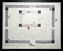
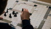
If anyone is interested in making their own, you'll need a black vintage game board from the board game "Dungeon!":
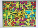
But what is relevant here is that the printed cut out pieces on top.
These are from a vintage Dungeon Design Kit included in some issues of Dragon Magazine:
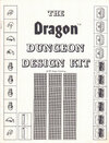
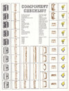
So, what I've done is isolate the specific parts and cut outs you'd need from the kit to make the board. Enjoy!
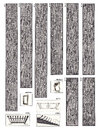
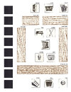
And here's a guide image for the board and what to put where:
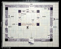


If anyone is interested in making their own, you'll need a black vintage game board from the board game "Dungeon!":

But what is relevant here is that the printed cut out pieces on top.
These are from a vintage Dungeon Design Kit included in some issues of Dragon Magazine:


So, what I've done is isolate the specific parts and cut outs you'd need from the kit to make the board. Enjoy!


And here's a guide image for the board and what to put where:

Similar threads
- Replies
- 0
- Views
- 143
- Replies
- 0
- Views
- 1,247
- Replies
- 4
- Views
- 738

