Severance

Hey guys! Thank's for this amazing cover, Astyanax!

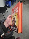
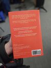
So I ended up taking the official book cover from Apple Books that cocomonk22 posted with the very clear and crips image of Ricken, and the book cover Astyanax created and combined them together for the best of both worlds. Posting a low resolution preview here. I also boosted the original book cover's DPI from 72dpi to 150dpi using AI upscaling which is good for most print cases.

Anyways, let me know if that's ok to post the full resolution file of the one I created, Astyanax, I don't want to step on your toes or anything.
 

Attachments

  • Severance Books_lowres.png
    Severance Books_lowres.png
    905.9 KB · Views: 68
Last edited:
Love it, thank you for sharing, and thanks for asking! It was always intended to be free and open here, so I look forward to your high-res post.

Thanks!
Bill
 
Thanks for posting! Are there any other changes besides the crystal clear Ricken?
Woops! Sorry I missed the question, no there are no other changes!

Also, love how my book turned out. I airbrushed the sides with orange paint and it turned out perfect.

Thanks a lot Astyanax!
 

Attachments

  • 20250210_170212.jpg
    20250210_170212.jpg
    161 KB · Views: 23
  • 20250210_170250.jpg
    20250210_170250.jpg
    231.8 KB · Views: 25
  • 20250210_170140.jpg
    20250210_170140.jpg
    130.1 KB · Views: 28
Woops! Sorry I missed the question, no there are no other changes!

Also, love how my book turned out. I airbrushed the sides with orange paint and it turned out perfect.

Thanks a lot Astyanax!

OMG, airbrush! Never even occurred to me!

duh.gif

May I ask what paper you ended up printing on?
 
OMG, airbrush! Never even occurred to me!

View attachment 1904912

May I ask what paper you ended up printing on?
So funny thing, I actually work at a print shop, so I have access to tons of paper options and a couple digital printing presses.

The paper I used for the cover is 100# Dull Text from Titan Digital, printed out on a 12x18 sheet, I think it's an extremely close weight match to the 'Look Out for the Little Guy' book cover.

Also, I figured I'd post this here as well, I re-created the Senior Refiner Checklist from the screenshot previously in the thread. It's an Illustrator PDF, so you can open it in Illustrator to edit, but you'll need the following font:
  • Forma DJR Display - This is available on Adobe fonts if you are subscribed to Adobe Creative Cloud. In retrospect I probably should have used Forma DJR Text, but I didn't realize there were multiple versions of Forma DJR.
I actually created a couple more that are not re-creations from the show but inspired documents that I made for a coworker's birthday, not sure if I'm allowed to post those here.
 

Attachments

  • Senior Refiner Morning Checklist.pdf
    496.9 KB · Views: 84
  • Senior Refiner Morning Checklist-01.jpg
    Senior Refiner Morning Checklist-01.jpg
    1.2 MB · Views: 108
Last edited:
So funny thing, I actually work at a print shop, so I have access to tons of paper options and a couple digital printing presses.

The paper I used for the cover is 100# Dull Text from Titan Digital, printed out on a 12x18 sheet, I think it's an extremely close weight match to the 'Look Out for the Little Guy' book cover.

Also, I figured I'd post this here as well, I re-created the Senior Refiner Checklist from the screenshot previously in the thread. It's an Illustrator PDF, so you can open it in Illustrator to edit, but you'll need the following font:
  • Forma DJR Display - This is available on Adobe fonts if you are subscribed to Adobe Creative Cloud. In retrospect I probably should have used Forma DJR Text, but I didn't realize there were multiple versions of Forma DJR.
I actually created a couple more that are not re-creations from the show but inspired documents that I made for a coworker's birthday, not sure if I'm allowed to post those here.

Thanks so much for the info and the contribution!
 
So I didn't see these available anywhere so I ended up creating these. The back is unfinished, because I couldn't tell what the back said in red when Milchick turned it over after getting it from the back of the toilet.

If anyone has any ideas I'll update the file!

I sized it at roughly 6"x3.75" based on relative sizes, but if anyone has notes, let me know!
 

Attachments

  • Ideographic Card Back.jpg
    Ideographic Card Back.jpg
    506.6 KB · Views: 139
  • Ideographic Card Front.jpg
    Ideographic Card Front.jpg
    946 KB · Views: 142
Almost a year ago I saw Astyanax's awesome recreation of Riken's book dust cover, so I said to myself that I had to do at least a mock-up of the front cover:
Book Cover Mockup 2.png
The portrait was enhanced with Topaz Photo AI, found all the fonts, but as you can see the background is just a placeholder, hence this is just a mock-up.

For some unknown reason, I was reluctant on watching the series, but last week I watched season 1 and the first 4 episodes of season 2 and I got hooked with the whole concept and the abundance of paper props.

With the release of the first 8 chapters on Apple Books, I have found a good quality photo of Riken with an extended background, but the top section was missing, so I used the cover from the audio book to recreate the top section:
download.png 9999x0w_3.png

This is the result:
Cover New 2-topaz-high fidelity v2-4x_3.png

And here's how the cover looks at this moment:
Book Cover Mockup New 2 Snmall.png

Made a lot of screencaps and did some of the paper props:
Image44.png Apology Envelope Front.png Apology Envelope Back.png

Image47.png Image49.png Apology Message Card Front.png Apology Message Card Inside.png

Image51.png Image53.png Pip's VIP Card Front.png Pip's VIP Card Back.png

The envelope is 252 x 231 mm printed and 140 x 100 mm fully closed. The inside part is optional. The apology card is 136 x 188 mm fully opened, while Pip's VIP card is 90 x 55 mm.

Image200.png Image201.png Image202_3.png Petey's Funeral Program Front.png Petey's Funeral Program Inside.png Sarum Prayer Card Front.png Sarum Prayer Card Back.png

Petey's Celebration of Life program is a standard LTR in size (279 x 216 mm), while the Sarum Prayer card is 70 x 50 mm. The back of the card is made up and is optional in lack of reference.

More will follow, but first I'll have to catch up with other projects (too much on the workbench).
 
Last edited:
I really like what you did with that cover and the how-to of the book, so I thank you for indirectly stirring me toward the series!
 
Petey's Celebration of Life program is a standard LTR in size (279 x 216 mm), while the Sarum Prayer card is 70 x 50 mm. The back of the card is made up and is optional in lack of reference.

A comment on the prayer card, which is awesome, by the way!

I noticed that it is clearly laminated with rounded corners:

severance.s01e04.1080p.web.h264-glhf.mkv_snapshot_30.09_[2025.02.15_08.49.03].jpg severance.s01e04.1080p.web.h264-glhf.mkv_snapshot_30.10_[2025.02.15_08.49.17].jpg severance.s01e04.1080p.web.h264-glhf.mkv_snapshot_30.10_[2025.02.15_08.49.23].jpg

The nearest standard laminating sheet size that makes sense to me is 2.32" by 3.70" (59mm x 94mm) in size:

1739638626322.png

So anyone printing, please consider resizing for lamination if that's what you intend!

Bill
 
A comment on the prayer card, which is awesome, by the way!

I noticed that it is clearly laminated with rounded corners:

View attachment 1906050 View attachment 1906051 View attachment 1906052

The nearest standard laminating sheet size that makes sense to me is 2.3" by 3.9" (59mm x 94mm) in size:

View attachment 1906053

So anyone printing, please consider resizing for lamination if that's what you intend!

Bill

Good catch! Somehow I missed those frames, so I'll have to see if I can update the prayer card. Thanks!
 
Image211_2.png Image212_2.png Sarum Prayer Card New Front.png Sarum Prayer Card New Back.png

Made as 90 x 55 mm in size. The corners of the card are straight, only the laminating pouch have round corners. I think the photo of Petey is more in line with the theme of the ceremony.
 
Last edited:
Nice work! :)

I like the illiterate attempt to be chic with the spelling error for "grill". It really says something. Like there used to be a café in Calgary years ago called "La Bagette"...
 
Back
Top