Playing with the face app and came across a pose and comp combo that I hadn't tried before.

You are using an out of date browser. It may not display this or other websites correctly.
You should upgrade or use an alternative browser.
You should upgrade or use an alternative browser.
Quint Cosplay - Robert Shaw Impersonation Cosplay costume - Jaws
Matt R
New Member
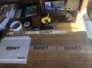
Great work! What marker pen did you use to achieve that look?I printed my image on my home printer using card stock. I then razor cut it and popped out the pieces:
View attachment 1761551
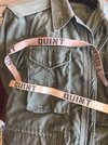
Then I placed my name tape across the back of the paper. I placed my fabric strip on packing tape so the tape stuck out past both top and bottom edge. My fabric is 1 inch cotton fabric ribbon tape, gaberdine weave, I think. I placed one end well past the end of the name and slowly lowered the fabric onto the name from end to end. The paper was face down at this point. By slowly going from one side to the other, you can center each letter in the fabric while pressing down on the tape a little at a time. This centered the name. It makes a huge difference as 3/4 letters in a 1 inch space MUST be centered vertically to look correct. I had made the fabric about 4 inches longer than needed because it would be hard to perfectly center lengthwise as well. I cut it to the appropriate 5 inches afterward. The I is exact center so marking 2.5 inches to either end of the center of the "I" is perfect for length. I used a grey marker and did NOT saturate the image. I only dabbed down and purposely left some fabric still showing grain. This was in hopes of making it look weathered. It is certainly not dark on his coat and is like a tan gray on a dirty tan background. Like moldy hay on slightly less moldy hay. When done, I could see I need to really age the fabric tape as well. But the print is really impressive compared to screen images.
View attachment 1761552View attachment 1761553View attachment 1761554
I will play with weathering and aging tomorrow. My print is alcohol markers so I will need to dirty it up with water based staining, to avoid bleeds.
Great work! What marker pen did you use to achieve that look?
My markers are "Touchfive" brand alcohol markers. A competitor to the very popular Copic brand.

However, even dollar store permanent markers can work because they are generally all alcohol markers in the permanent marker craft section. I used the cg6 and cg7, cool grays.

Be wary and slow, tap at it, with at least a half second between taps. At the edges of the letters, draw inward to the center of the letter, dragging from on the stencil to into the letter and not from inside to outside. This will limit the amount of liquid soaking in at the edges. You need to let the alcohol fume away and not wick away. If you begin to saturate the cloth tag with the pen, it will wick out sideways and then needs to be dabbed up with an alcohol swab (again light on the alcohol). If you do need to do cleanup with cotton swabs be willing to use a lot. Once the swab is showing color it can also put it back on your tag so use another and another. Best bet is to slowly apply from the start, letting each added dot dry.
The lines will blur a little and will be needing some cleanup but the following is what happens when you go too fast:
In that image, a very precise rectangle was initially drawn. All the color around it is liquid bleed.
Do all of this with the tag before placing the dry finished version on the coat, including weathering and staining the white section.
Last edited:
Matt R
New Member
Thanks for that detailed reply and explanation, really appreciate it. I’m in the process of making the name tape so any suggestions are super helpful. I’m currently starting the weathering of the white cotton tape by soaking it in cold tea for a few days to create a first layer of aging.
Having some of this new hat build in,
Thread 'JAWS: Quint from the ground up (Shoes, Pants, Shirt, Jacket, Hat)' JAWS: Quint from the ground up (Shoes, Pants, Shirt, Jacket, Hat)
I am putting the process notes here so I don't fill up the other (not mine) with just testing.
The hat from Murray's (link in the thread listed here) was pink or Nantucket Red. The shape is spot on except two adjustments needed, lower the front pocket and shorten the bill. This bill will follow the sizes of my earlier hat build so just reference those.


I washed the hats to remove any waterproofing so I could dye them. I used a combo of rit dye, green, black and brown. I bought two hats of different sizes to try.

After the dye process the color looks great but the threads were still pink.

I was able to remove the visible threads by removing the seam covers. Ya, seam covers, these are really nice caps. The front pocket thread can be removed along its upper edge because it will be folded down to straight and resewn (it comes with an upward curve).

The bill on the large hat is passable for length but the bill on the smaller hat is very long and would need to be cut down like my original build. Please follow those earlier instructions for trimming.
So far this hat looks amazing with just dye and removing the pink visible threads. That is an easy yes for me on purchasing these from Murrays.
Thread 'JAWS: Quint from the ground up (Shoes, Pants, Shirt, Jacket, Hat)' JAWS: Quint from the ground up (Shoes, Pants, Shirt, Jacket, Hat)
I am putting the process notes here so I don't fill up the other (not mine) with just testing.
The hat from Murray's (link in the thread listed here) was pink or Nantucket Red. The shape is spot on except two adjustments needed, lower the front pocket and shorten the bill. This bill will follow the sizes of my earlier hat build so just reference those.
I washed the hats to remove any waterproofing so I could dye them. I used a combo of rit dye, green, black and brown. I bought two hats of different sizes to try.
After the dye process the color looks great but the threads were still pink.
I was able to remove the visible threads by removing the seam covers. Ya, seam covers, these are really nice caps. The front pocket thread can be removed along its upper edge because it will be folded down to straight and resewn (it comes with an upward curve).
The bill on the large hat is passable for length but the bill on the smaller hat is very long and would need to be cut down like my original build. Please follow those earlier instructions for trimming.
So far this hat looks amazing with just dye and removing the pink visible threads. That is an easy yes for me on purchasing these from Murrays.
Matt R
New Member
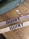
Finally got round to working on the name tape after far too long a delay.My markers are "Touchfive" brand alcohol markers. A competitor to the very popular Copic brand.
View attachment 1861413
However, even dollar store permanent markers can work because they are generally all alcohol markers in the permanent marker craft section. I used the cg6 and cg7, cool grays.
View attachment 1861414
Be wary and slow, tap at it, with at least a half second between taps. At the edges of the letters, draw inward to the center of the letter, dragging from on the stencil to into the letter and not from inside to outside. This will limit the amount of liquid soaking in at the edges. You need to let the alcohol fume away and not wick away. If you begin to saturate the cloth tag with the pen, it will wick out sideways and then needs to be dabbed up with an alcohol swab (again light on the alcohol). If you do need to do cleanup with cotton swabs be willing to use a lot. Once the swab is showing color it can also put it back on your tag so use another and another. Best bet is to slowly apply from the start, letting each added dot dry.
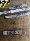
The lines will blur a little and will be needing some cleanup but the following is what happens when you go too fast:
View attachment 1861415
In that image, a very precise rectangle was initially drawn. All the color around it is liquid bleed.
Do all of this with the tag before placing the dry finished version on the coat, including weathering and staining the white section.
Your suggestions of the 2 shades of grey works really well. I initially tried to age the fabric tape by staining it in tea but it didn't give the appearance I wanted, you can see the contrast in the pictures. After looking for a Khaki fabric dye that actually looked Khaki (they're all too bright green!) I finally found Dylon Pebble Beige that actually looks like period Khaki...result!
I'll give the ink a day or 2 to dry before cutting & stitching the tape to the jacket. I managed to find a late issue M51 in really good but worn condition that works perfectly.
Attachments
Finally got round to working on the name tape after far too long a delay.
Your suggestions of the 2 shades of grey works really well. I initially tried to age the fabric tape by staining it in tea but it didn't give the appearance I wanted, you can see the contrast in the pictures. After looking for a Khaki fabric dye that actually looked Khaki (they're all too bright green!) I finally found Dylon Pebble Beige that actually looks like period Khaki...result!
I'll give the ink a day or 2 to dry before cutting & stitching the tape to the jacket. I managed to find a late issue M51 in really good but worn condition that works perfectly.
I love the setup you made for the inking process.
These look perfect.
I think the tea stain set at 3 or 4 times the expected aging look just due to the fiber type. I had the same issue with my first inks (same as your over active tea) because the natural fibers wick so well the ink would not stay in one spot. I continued to get ink coming up an inch away. Finally figured out it was wicking along the internal weave structure and needed to have the ink put on in stages. Put on a bit, then dry fully, then a little more. The alcohol pens are great for this as they evaporate quickly IF applied in stages.
Can't wait to see your progress.
Matt R
New Member
Thanks, I found it was so much easier to staple the tape across an off cut of wooden kitchen worktop that I had kicking around to ensure it didn’t drift while stencilling. I’m still debating whether to try & find a way of sealing the tape & lettering that won’t show, maybe I’m just overthinking it!! Lol
I’d like to try & add some hidden provenance to the inside as well, maybe Quints old unit & service number perhaps, if plausible details exist somewhere?
I’d like to try & add some hidden provenance to the inside as well, maybe Quints old unit & service number perhaps, if plausible details exist somewhere?
That has two parts. First, I totally agree on sealing the tape but admittedly have not found a method I like. Using anything alcohol based just reactivates the ink and causes surges of upwelling color elsewhere. Spray on would create a gloss as would heat treated thermal clear (tshirt vinyl transfer) and soaking in any acrylics (clear) would make it stiff. If you find a method that works, please post again. Which brings me to point two: Your question on the background details will have a larger audience on BossThreads main Quint page but would be well served on Shaw's son's website, thedailyjaws. I will get links for both.Thanks, I found it was so much easier to staple the tape across an off cut of wooden kitchen worktop that I had kicking around to ensure it didn’t drift while stencilling. I’m still debating whether to try & find a way of sealing the tape & lettering that won’t show, maybe I’m just overthinking it!! Lol
I’d like to try & add some hidden provenance to the inside as well, maybe Quints old unit & service number perhaps, if plausible details exist somewhere?

About Us — The Daily Jaws
 thedailyjaws.com
And looks like I need to do a bit more research on his son's involvement on the site may just be a frequent guest. Still checking on this. However, the site is the paramount jaws source from what I see and asking your question with the staff there is your best shot. Remember that the speech about his navy days and sharks IS a real unit so that would be the accurate group he was in from the sinking of that ship.
Last edited:
And this is our version of "All things Quint", bossthread's build and convo coffeeshop/pose bragging drop zone:
Thread 'JAWS: Quint from the ground up (Shoes, Pants, Shirt, Jacket, Hat)' JAWS: Quint from the ground up (Shoes, Pants, Shirt, Jacket, Hat)
Definitely post your tape progress there as well and for sure, any final poses. You can copy your post link from here by clicking the little share icon and copying the thread url to paste in the other. I know everyone will appreciate seeing your alignment process on the tape production.
Matt R
New Member
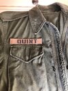
Finally happy with the name tape. The 2nd picture makes it look paler than it actually is. I gave the tape quite a few passes with a Rustoleum acrylic clear coat, drying with a hot air gun in between & then carefully taking it back with a fine sandpaper until I was happy with the overall tone. The acrylic spray didn’t cause the ink to bleed further which was my initial concern.
When it is stitched to the jacket I will add another final dusting of fullers earth just to bring it down to the well used look.
When it is stitched to the jacket I will add another final dusting of fullers earth just to bring it down to the well used look.
Attachments
Matt R
New Member
I see what you did there! ")
It was a bit of a risk but it was a repeated fine spray, dried in between, then carefully flexed & sanded with a very fine paper. So far no adverse problems and it has added the worn aged texture I was hoping it might.
I'm wondering if I sprayed the acrylic first & then added the lettering whether it would reduce the bleed through on the cotton fibres. If I need another one then it will be worth trying.
joberg
Legendary Member
You might be on to something by spraying the acrylic first and then doing the lettering afterI see what you did there!
It was a bit of a risk but it was a repeated fine spray, dried in between, then carefully flexed & sanded with a very fine paper. So far no adverse problems and it has added the worn aged texture I was hoping it might.
I'm wondering if I sprayed the acrylic first & then added the lettering whether it would reduce the bleed through on the cotton fibres. If I need another one then it will be worth trying.
I see what you did there!
It was a bit of a risk but it was a repeated fine spray, dried in between, then carefully flexed & sanded with a very fine paper. So far no adverse problems and it has added the worn aged texture I was hoping it might.
I'm wondering if I sprayed the acrylic first & then added the lettering whether it would reduce the bleed through on the cotton fibres. If I need another one then it will be worth trying.
This may be an intense find if you have created a prep step that stops the bleed. Honestly that could come in play in so many builds. Imagine blood stains staying where they match the onscreen and not "bleeding" or paling out into the threads. Add this to the list of "must know" experiments. If you do a second run, definitely post outcomes.
Similar threads
- Replies
- 25
- Views
- 674
- Replies
- 37
- Views
- 2,431
- Replies
- 55
- Views
- 10,306
- Replies
- 11
- Views
- 2,513
- Replies
- 14
- Views
- 3,025