That's a HUGE help -- thanks so much for the hack! (On the rear maintenance pit, is the right-side Kettenkrad "elevated" or is it simply something you were willing to live with?)
You are using an out of date browser. It may not display this or other websites correctly.
You should upgrade or use an alternative browser.
You should upgrade or use an alternative browser.
Our Collective 5-Foot Millennium Falcon Build
- Thread starter Studio Kitbash
- Start date
5-Foot Falcon builders, please acquire eventually: Letraset Futura Bold 8/10 font size.
This is the lettering ILM used to put all the modeler's names all over the bottom of the ship. Still readily available on Ebay (even if not done by Letraset), and even if you are at the advanced level of graphic designing your own decals, you'll want to deploy the Futura Bold font in 10 point-font size to make these.
This is the lettering ILM used to put all the modeler's names all over the bottom of the ship. Still readily available on Ebay (even if not done by Letraset), and even if you are at the advanced level of graphic designing your own decals, you'll want to deploy the Futura Bold font in 10 point-font size to make these.
5-Foot Falcon builders, please acquire eventually: Letraset Futura Bold 8/10 font size.
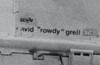
Hi. I'm thinking at least one of the names - David Grell - doesn't look like Futura. It looks more like Helvetica. Perhaps they used different typefaces on the model?

The Names of the Millennium Falcon
No, not aliases under which the fantasy spaceship is purported to have flown. But simply and quite literally the names inscribed on the models.
 sites.google.com
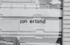
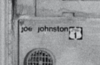
Agreed -- and several are handwritten. For the rub-on lettering, does David Grell look to your eye as the same font as Joe Johnston or Paul Huston? Those were the two that look the most Futura Bold to my eye.
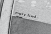
Well, Mary Lind looks like Futura Medium to me. I don't think it's as heavy as Bold.
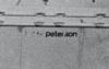
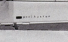
David Grell, Jon Erland, and Joe Johnston look like Helvetica Medium. The letters "a" and "o" are the giveaways - they're either letters with bowls or ovals, not circles like Futura. I don't have a clear view of Lorne Peterson or Paul Huston. The "Dave Beasley" possible is pretty scratched.
It's really hard to say, since we don't have any great high-rez views of the five foot Falcon's underside. :/
Attachments

Okay, I had a look at my files and the ILM shots taken in around 1978 do have a fair bit of detail. Those are the same as the ones printed in the Japanese Chronicles book.
Basically Mary Lind looks like Futura Medium. Paul Huston looks Futura Light, perhaps. The rest look like Helvetica Medium or something similar. All lowercase; potentially with the dots on the Js but not the Is intentionally omitted. The letterspacing varies for each name. I don't see any handwritten names on the five footer - just on the 32".
Basically Mary Lind looks like Futura Medium. Paul Huston looks Futura Light, perhaps. The rest look like Helvetica Medium or something similar. All lowercase; potentially with the dots on the Js but not the Is intentionally omitted. The letterspacing varies for each name. I don't see any handwritten names on the five footer - just on the 32".
Attachments
-
 Screenshot 2020-04-21 at 09.49.50.png50.1 KB · Views: 317
 -
 Screenshot 2020-04-21 at 09.50.15.png233.8 KB · Views: 296
 -
 Screenshot 2020-04-21 at 09.50.47.png98.6 KB · Views: 317
 -
 Screenshot 2020-04-21 at 09.51.59.png88.6 KB · Views: 300
 -
 Screenshot 2020-04-21 at 09.51.11.png103.3 KB · Views: 314
 -
 Screenshot 2020-04-21 at 09.55.26.png448.8 KB · Views: 294
This is very helpful to have multiple eyes on ID the actual font. Much appreciated.
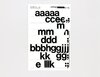
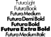
Here are the Letraset catalog scans of the fonts under discussion:

Letraset Futura Bold

Letraset Futura Medium

Letraset Helvetica Medium
Given the details, I tend to think NKG is right. The key to Helvetica are the horizontal terminals, which it "looks" like you get on Jon Erland, Lorne Peterson, and Joe Johnston. And if the others are Futura, I think they may be Futura Medium instead of Bold, though at 10 points, I still tend to lean towards Futura Bold for Mary Lind, which would make Paul Huston Futura Medium, not light. But this is just my first opinion upon looking at the available references. This may change again once I actually start building the model and placing the letters on, which is like step 1000 while I'm actually at about step 5 right now. Anyway, it's an invitation for others to chime in, and give us what they see, and/or other builders, to tell us which ones they used.
Here are the Letraset catalog scans of the fonts under discussion:
Letraset Futura Bold
Letraset Futura Medium
Letraset Helvetica Medium
Given the details, I tend to think NKG is right. The key to Helvetica are the horizontal terminals, which it "looks" like you get on Jon Erland, Lorne Peterson, and Joe Johnston. And if the others are Futura, I think they may be Futura Medium instead of Bold, though at 10 points, I still tend to lean towards Futura Bold for Mary Lind, which would make Paul Huston Futura Medium, not light. But this is just my first opinion upon looking at the available references. This may change again once I actually start building the model and placing the letters on, which is like step 1000 while I'm actually at about step 5 right now. Anyway, it's an invitation for others to chime in, and give us what they see, and/or other builders, to tell us which ones they used.
I have thought alot about these names which are placed over many areas of the miniature, mainly thinking would I add them or not!.
I know it's a personal preference to the replica builder to add or not to add, but for me, I will not, well, not the names that are in the miniature, rather the names of the amazing people that have helped my build along the way!.
To me it seems wrong to add the names of the various ILMers onto a replica they had no part in making. I know I know for exacting accuracy yes, you could put their names on, but ethically it doesn't gel with me.
I'd rather have the names of folks that are personal to me in the journey of my build present. The fonts would be the same of course & names in all the right places, but this is just me & my thinking.
There are a number of primary differences between Helvetica and Futura that I'd look for.
- Lowercase "a". Helvetica has a two-storey a. Futura has a one-storey a. This is kind of a key diagnostic for identifying the typeface used for Lind and Huston.
- Shape forms. Helvetica is not geometric, and letters like O are narrow ovals and not circles. Futura is pretty geometric, and letters like a and o are circular. Also useful.
- Stroke width. Helvetica has variable stroke width; Futura has an almost even stroke width. Not so useful given these semi low-rez photos.
- Ascenders. Helvetica has shorter ascenders on lowercase letters. Futura, because of the geometric forms, has tall ascenders on lowercase letters.
Last edited:
Sparky70
Well-Known Member
Does anyone know what these parts are from?
I've searched through all the kits I have but drawn a blank, just need these last few parts and a couple of others to finish the pits.
I'll gladly share ID's that I've managed to find, but need some help on these.
Thanks if anyone can help.


I've searched through all the kits I have but drawn a blank, just need these last few parts and a couple of others to finish the pits.
I'll gladly share ID's that I've managed to find, but need some help on these.
Thanks if anyone can help.
I still tend to lean towards Futura Bold for Mary Lind, which would make Paul Huston Futura Medium, not light.
Hm. Some type houses offer Futura in a "Demi" weight which is a bit lighter than "Bold". Did Letraset ever do that? I can't seem to find any authoritative list of the typefaces they offered.
"mary lind" just doesn't seem quite heavy enough to be Futura Bold for me. But it's such a low-rez scan it's hard to know for sure.
Okay - my vote is for Futura Demi Bold for Mary Lind. Assuming that particular variety was sold in the US in 1976. ")
Attachments
Last edited:
I could easily be persuaded to the Futura Demi-Bold for Mary Lind.
Sparky70,
You're ahead of me on the mandible pits (yours look great by the way), and I don't have any of those IDs yet either.
What OD width are your mandible pits, and what is your height? Also, did you use the "same height" on each pit, or did you use "different heights" depending on the greeblies needed to go inside?
Sparky70
Well-Known Member
Thanks for the kind words, I used the same tube that you're using with the exception of one of the pits (the one with the Matilda deck) I felt that this needed to be slightly larger than the others to get the greeblies to look right, not by a lot though, 93mm OD, I also made this shallower than the others at 16mm.
So, working clockwise top left in the picture this is what I came up with;
1st pit - as above
2nd pit - 19.79mm depth
3rd pit - 20.3mm
4th pit - 19.93mm
5th pit - 22.35mm
6th pit - 21mm
7th pit - 20.36mm
8th pit - 21mm
Tried to keep them all as shallow as I could for them to fit in the space between the top and bottom of the mandibles whilst still retaining the height of key parts, and even then some parts still require a slight trim.
All the best with your build
Rich
Similar threads
- Replies
- 11
- Views
- 1,015
- Replies
- 4
- Views
- 2,048
- Replies
- 2
- Views
- 871