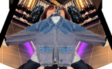
Mitas Touch gave them all the information they could ever need and we each provided feedback direct to them too. As I understand, certain processes were no longer available to them which prevented them getting the exact finish we so desired. Most of the inaccuracies I could stomach, since only the hard core few would ever spot them in the wild, but the colour is the literal face of the jacket, so when that's off, it all looks off. A little less blue, a little more grey needed in my humble (and very unprofessional!) opinion.