Hi guys.
Im so happy to finally post this as this has been a long time coming...... I present *** The 1912 diary.***
So much work has gone into this. So much planning, refining and refurbishing. Such nitpicky and tedious work gone into this but it finally paid off. Its my best work and my personal treasure!
So, I have allways wondered what the 1912 Grail diary would look like if it was used in the film and was a real book and here it is!! One of the coolest diaries I have made, ever! I've said this many times but I work best when I have creativity freedom. I just escape from the world. All made from scratch with a blank piece of paper and raw undyed leather. The pages are printed out and bound using a kettle stitch like the original. The leather is carefully cut, shawen, handdyed, tooled. Everything is freestyled.
The overall breakdown of the diary is: a 1912 cover with B prop paper given the hero prop treament. So its a funny one but I oh so love it. It has all the bells and whistles to make this as believable as a real life book could be. It features the lined paper from the infamous B props. Which took forever to source dow. Very difficult indeed as I dont think this paper is made anymore, not in the way it used to be made. I say this cuz I have experience with working with paper in my earlier life. I used to work as a printer and we sourced extremely rare paper every now and then. However I dont work there anymore but still keep in contact every now and then.
Ok, I'm rambling, so yeah, It just feels so much more vintage and turnes out so lovley and old looking when aged. This diary is such a dream come true diary as I have allways wondered what the 1912 diary must have felt like and now I know, well, in my Universe rightfully so.
The cover resembles a more aged and tattered up 1912 cover as showcased in the Star wars to Indiana Jones book. I made sure it had the correct embossed border - flipped around of course and the correct 7 lines at the spine. The cover color is lighter then the hero prop but darker then the 1912 cover. Its a good inbetween shade. Leans more towards the B props (Propstore)
Like mentioned above, I was very inspired by the 1912 diary from the Lucas book. Seeing that diary, my thoughs were allways what would that particular diary look like if it aged for 40 years? I gathered my tools and went to work and I think it came out fantastic. I aged the cover so it still is recognizable to both 1912 and hero prop as I made sure it had some recognizable 1912 scratches at the front and some hero prop scratches at the back.
The aging on the paper is somewhat more toned down and resembles the aging of the B prop Grail diary, (Propstore) which I love dearly!! I am also very inspired by the Christies and Williams diarries when it comes to the aging and watercoloring on the pages. Allways loved those!!
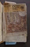
Lets see...it has a real french franc instead of the watercolored one. When it comes to the camel pack I tried to put in a real one in but honestly it just doesn't feel right. The design and the silvery stuff is just really off putting so I kept the good ol' hero prop camel pack. No blue sharpie marking on maps etc like in the hero prop either, only water color in this book. No hero prop tape residue and glue spots either.
So yeah... No prop replica only a real deal - hard life - every day abuser. A Tool in search of the Holy Grail. The one exact book Indy brings all the way back to Brunwald castle. You know.. ''You think my schon will be that schtupid and bring my diary all the way back here'' LOL.
Btw, for those who dont know what the Tool diary is. Its basicley a diary wihtout repeated pages. It has no story, only pages with hints and clues that connect to the grail lore. Like it should be!!!!
All drawings are refurbished and given an extra care to make them resemble the real grail diary illustrations even more. Handwriting is also refined. One thing I really enjoy doing is putting a faded and greyer looking illustration next to a crisp black one. That is such a nice touch IMO. I allways loved that detail of the Hero prop. For example, think of the blacker Melchizedek next to the greyer cup / knight page. Such a lovely detail!
OK, that all said, here is one of the fun details where its gonna connect even more to 1912. I have said this before, like 15, 20 + years ago but In 1912 we see Henry draw the Venice knight with an X above its head. That X should still be in the diary thruout the entire film and it allways bothered me that it does not show in the Library scene. However, I fixed that for my personal book and truthfully, that little X was the spark to make the ''Tool diary'' in the first place way back in 2016. Its kinda true what they say, big things have small beginings.
I hope you will enjoy this as its basicley the most realistic and coolest Tool diary version I have ever made. It just feels so real and vintage. I cant describe it better, you'd have to hold it in your hands to feel it. Speaking of which.. you might have the chance. I actually made 2 nearly identical 1912 diaries. They are not 100% the same as I never make two diaries the same. Thats just my style making these as I like them unique. However, the differences between these two are just different insert placements other than that they are the same!
So if you want it be sure to keep your eyes peeled cuz I dont know if I am going to make more of these 1912 Tool diaries. I need to save this paper for the B props I am going to make further down the line. So these two B prop Toolers are pretty rare! :whip:
And now its finally time to showcase the entire diary! I hope it inspires others to make their own book. So please let me know what you think cuz I really need group therapy. lol
Cheers
Holt
Covers!
A very accurate representation to the naked eye


The diary itself. In no particular order


THE 1912 X!!! :whip:


Im so happy to finally post this as this has been a long time coming...... I present *** The 1912 diary.***
So much work has gone into this. So much planning, refining and refurbishing. Such nitpicky and tedious work gone into this but it finally paid off. Its my best work and my personal treasure!
So, I have allways wondered what the 1912 Grail diary would look like if it was used in the film and was a real book and here it is!! One of the coolest diaries I have made, ever! I've said this many times but I work best when I have creativity freedom. I just escape from the world. All made from scratch with a blank piece of paper and raw undyed leather. The pages are printed out and bound using a kettle stitch like the original. The leather is carefully cut, shawen, handdyed, tooled. Everything is freestyled.
The overall breakdown of the diary is: a 1912 cover with B prop paper given the hero prop treament. So its a funny one but I oh so love it. It has all the bells and whistles to make this as believable as a real life book could be. It features the lined paper from the infamous B props. Which took forever to source dow. Very difficult indeed as I dont think this paper is made anymore, not in the way it used to be made. I say this cuz I have experience with working with paper in my earlier life. I used to work as a printer and we sourced extremely rare paper every now and then. However I dont work there anymore but still keep in contact every now and then.
Ok, I'm rambling, so yeah, It just feels so much more vintage and turnes out so lovley and old looking when aged. This diary is such a dream come true diary as I have allways wondered what the 1912 diary must have felt like and now I know, well, in my Universe rightfully so.
The cover resembles a more aged and tattered up 1912 cover as showcased in the Star wars to Indiana Jones book. I made sure it had the correct embossed border - flipped around of course and the correct 7 lines at the spine. The cover color is lighter then the hero prop but darker then the 1912 cover. Its a good inbetween shade. Leans more towards the B props (Propstore)
Like mentioned above, I was very inspired by the 1912 diary from the Lucas book. Seeing that diary, my thoughs were allways what would that particular diary look like if it aged for 40 years? I gathered my tools and went to work and I think it came out fantastic. I aged the cover so it still is recognizable to both 1912 and hero prop as I made sure it had some recognizable 1912 scratches at the front and some hero prop scratches at the back.
The aging on the paper is somewhat more toned down and resembles the aging of the B prop Grail diary, (Propstore) which I love dearly!! I am also very inspired by the Christies and Williams diarries when it comes to the aging and watercoloring on the pages. Allways loved those!!
Lets see...it has a real french franc instead of the watercolored one. When it comes to the camel pack I tried to put in a real one in but honestly it just doesn't feel right. The design and the silvery stuff is just really off putting so I kept the good ol' hero prop camel pack. No blue sharpie marking on maps etc like in the hero prop either, only water color in this book. No hero prop tape residue and glue spots either.
So yeah... No prop replica only a real deal - hard life - every day abuser. A Tool in search of the Holy Grail. The one exact book Indy brings all the way back to Brunwald castle. You know.. ''You think my schon will be that schtupid and bring my diary all the way back here'' LOL.
Btw, for those who dont know what the Tool diary is. Its basicley a diary wihtout repeated pages. It has no story, only pages with hints and clues that connect to the grail lore. Like it should be!!!!
All drawings are refurbished and given an extra care to make them resemble the real grail diary illustrations even more. Handwriting is also refined. One thing I really enjoy doing is putting a faded and greyer looking illustration next to a crisp black one. That is such a nice touch IMO. I allways loved that detail of the Hero prop. For example, think of the blacker Melchizedek next to the greyer cup / knight page. Such a lovely detail!
OK, that all said, here is one of the fun details where its gonna connect even more to 1912. I have said this before, like 15, 20 + years ago but In 1912 we see Henry draw the Venice knight with an X above its head. That X should still be in the diary thruout the entire film and it allways bothered me that it does not show in the Library scene. However, I fixed that for my personal book and truthfully, that little X was the spark to make the ''Tool diary'' in the first place way back in 2016. Its kinda true what they say, big things have small beginings.
I hope you will enjoy this as its basicley the most realistic and coolest Tool diary version I have ever made. It just feels so real and vintage. I cant describe it better, you'd have to hold it in your hands to feel it. Speaking of which.. you might have the chance. I actually made 2 nearly identical 1912 diaries. They are not 100% the same as I never make two diaries the same. Thats just my style making these as I like them unique. However, the differences between these two are just different insert placements other than that they are the same!
So if you want it be sure to keep your eyes peeled cuz I dont know if I am going to make more of these 1912 Tool diaries. I need to save this paper for the B props I am going to make further down the line. So these two B prop Toolers are pretty rare! :whip:
And now its finally time to showcase the entire diary! I hope it inspires others to make their own book. So please let me know what you think cuz I really need group therapy. lol
Cheers
Holt
Covers!
A very accurate representation to the naked eye
The diary itself. In no particular order
THE 1912 X!!! :whip:
Last edited: